
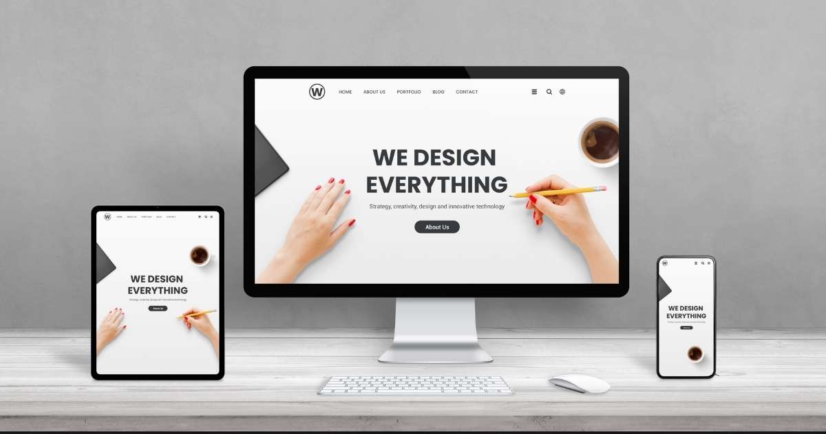
In 2024, having a responsive website is no longer just a nice-to-have feature—it’s a necessity. With the increasing dominance of mobile devices and varying screen sizes, businesses must ensure their websites adapt seamlessly to any device.
Responsive web design (RWD) ensures that your site not only looks good but also performs well on smartphones, tablets, and desktops alike. This blog will delve into why responsive web design is so critical in 2024 and how Elif Technologies can help you stay ahead.
What is Responsive Web Design?
Responsive web design is an approach that makes websites adaptable to any screen size or device by utilizing fluid grids, flexible images, and media queries. Instead of creating separate designs for desktop, mobile, and tablet, RWD ensures a consistent and optimized experience regardless of how users access your site.
- Fluid grids scale the layout proportionally rather than based on fixed pixels.
- Flexible images automatically resize within their containing element.
- Media queries apply different CSS styles depending on the device’s screen size.
In short, RWD provides flexibility, ensuring your website works well across all platforms.
Why Responsive Web Design is Crucial in 2024
With over 60% of web traffic now coming from mobile devices, it’s essential to provide an optimal experience for mobile users. But why exactly does responsive design matter this year more than ever?
- Google’s Mobile-First Indexing: Since Google predominantly uses the mobile version of a website for indexing and ranking, a non-responsive site can hurt your SEO efforts.
- Multi-Device Usage: Users switch between devices—smartphones, tablets, laptops, and even smart TVs. Your website needs to offer a seamless experience across all these touchpoints.
- Performance is Key: Mobile users expect fast load times. If your site isn’t optimized for mobile, visitors will likely leave, hurting both your engagement and conversion rates.
- Changing User Expectations: In 2024, users expect websites to function flawlessly on all devices. A responsive website ensures you meet these expectations, boosting user satisfaction.
Key Benefits of Responsive Web Design
Enhanced User Experience
Responsive design makes it easier for visitors to interact with your site, whether they’re on a smartphone, tablet, or desktop. A positive user experience encourages visitors to stay longer, engage with your content, and convert into customers.
Improved SEO Rankings
Google now prioritizes mobile-friendly websites in its search rankings, thanks to mobile-first indexing. A responsive website, optimized for mobile, can significantly improve your site’s visibility on search engine results pages (SERPs).
Increased Conversion Rates
A seamless browsing experience across all devices can result in higher conversion rates. Studies show that users are more likely to complete purchases or engage with content when they can easily navigate a website on any device.
Cost and Maintenance Efficiency
Instead of building separate versions of your website for mobile and desktop, a single responsive site can handle all devices. This means less development time, fewer resources spent on updates, and simpler maintenance.
Future-Proofing Your Website
Technology evolves rapidly, and new devices are constantly entering the market. A responsive website ensures your site will continue to work well on future devices with different screen sizes and resolutions.
Key Elements of a Successful Responsive Web Design
Mobile-First Approach
In 2024, designing for mobile-first is a best practice. Start by creating a layout that works perfectly on small screens, then scale up for larger devices like tablets and desktops.
Optimized Load Times
Speed is crucial for both user experience and SEO. Eliminate unnecessary scripts, compress images, and use responsive design principles to ensure quick load times on all devices, particularly for mobile users.
Touch-Friendly Navigation
Buttons, links, and menus need to be easy to tap and navigate on touchscreens. Ensure the design allows for smooth interaction, whether users are on a smartphone or tablet.
Consistent Branding Across Devices
Your brand identity should remain consistent, regardless of the device. Responsive design ensures fonts, colors, logos, and overall brand feel translate smoothly across all screen sizes, reinforcing brand recognition.
Case Studies: Responsive Web Design in Action
At Elif Technologies, we’ve helped numerous clients optimize their websites through responsive web design, leading to significant improvements in user experience, search engine rankings, and conversion rates. Here are a couple of examples:
Homevolve.co.uk
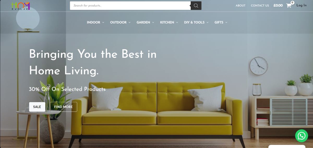
Before adopting responsive design, homevolve struggled with poor mobile user engagement. After redesigning the site with a mobile-first approach, mobile traffic increased by 45%, with a 30% boost in overall conversions.
Radkasillerova.com
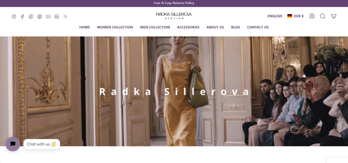
Radka’s e-commerce website was slow on mobile devices, leading to high bounce rates. After optimizing the site for speed and responsiveness, the site’s mobile bounce rate dropped by 20%, and page load times improved significantly.
How Elif Technologies Can Help
At Elif Technologies, we understand the importance of responsive web design in today’s digital landscape. Our team specializes in creating websites that are mobile-friendly, fast, and fully responsive. Whether you need a new website or want to redesign your existing site, we’ve got the expertise to help.
- Tailored Web Design: We work closely with you to understand your business needs and craft a website that aligns with your goals.
- SEO and Performance Optimization: Our responsive designs are built with SEO in mind, ensuring your site ranks well and loads quickly on all devices.
- User-Centric Approach: We prioritize user experience, ensuring your visitors have a seamless journey no matter what device they use.
Conclusion: Make Your Website Future-Ready with Responsive Design
In 2024, responsive web design is critical to staying competitive in the digital space. If your website isn’t optimized for mobile devices, you risk losing potential customers, search rankings, and conversions. Let Elif Technologies help you create a responsive website that drives results.